OBJECTIVE
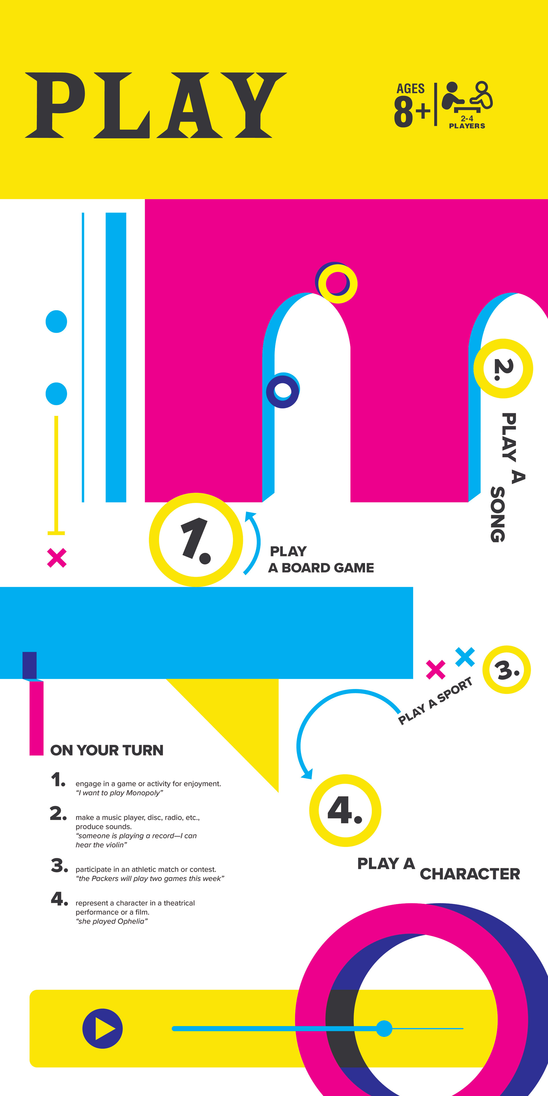
Design and produce a printed piece that explores the literal and denotative meanings, as well as social contexts of the word "play." The final poster must be 11”x17” horizontal or vertical with the format decision being based on the conceptual, emotional, and contextual content of the piece. Color is limited to no more than three different colors.
TOOLS USED : Adobe Illustrator, Adobe Indesign

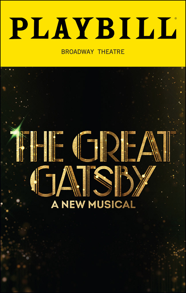
The decision to format this poster vertically came from the formatting of Playbills given out at theatrical performances.
Because many of the cultural understandings of "play" involve action, the poster needed to feel energetic, almost as if it were moving. By offsetting some shapes, an illusion of depth is created and with it, movement implied. Angled and broken text, arrows, color, and shape are all intentionally laid out so that the eye can find a clear path through the poster.

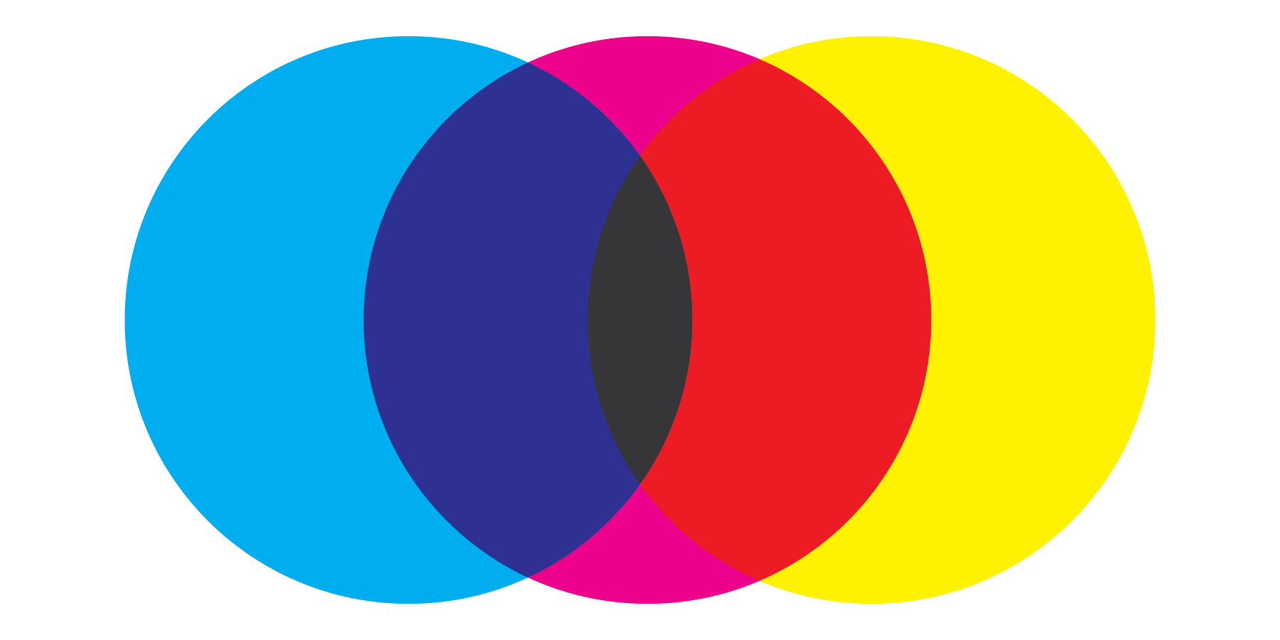
Play comes with a very bright and colorful cultural context. I could have simply used cyan, magenta, and yellow, but then the black of "Playbill" would not immediately convey the correct meaning. With the color palette being limited to three, I had to figure out a way to bend the rules without breaking them. To do this, I used the "multiply" function that simulates color blending similar to the method used in screen printing.